GO Transit Mobile App
A team Figma concept, rebuilt solo into a 16-screen working app — with a real payment flow, dark mode, and accessibility considered from the start.


Project Context
GO Transit runs Canada's largest commuter rail network — without a native app to ride it.
GO Transit moves over 72 million riders a year across five rail lines and a regional bus network covering southern Ontario. Despite that scale, there's no dedicated iOS or Android app for the rider experience — schedules, tickets, alerts, and trip planning all live on a mobile website that wasn't designed for phones.
For riders, that means buying tickets at station kiosks, refreshing a slow web page to check delays, and stitching together a journey across PRESTO, Google Maps, and the GO Transit site. For GO Transit, it's a fragmented experience that quietly costs riders, revenue, and engagement every day.
Role
Solo design + build, expanded from team Figma concept
Timeline
Sept 2024 – May 2026 (school project → portfolio rebuild)
Team
Original Figma concept: James Ibitoye, Emily Li, Cindy Lin
Tools
Figma · React · TypeScript · Framer · Claude Code
The Starting Point
7 static Figma screens — a concept, not a product
A team of 3 surveyed 26 GO Transit commuters and built this for our Interactive Systems course. The research was solid. The prototype showed the idea — but couldn't do anything yet.


No payment flow
"Buy Ticket" led nowhere. Users could explore — but couldn't purchase. The app was a brochure.
No dark mode
Most GO rides happen at 6 AM or 6 PM. An app for commuters had no low-light consideration.
One route only
Only the Stouffville Line. Four other GO lines and the Highway 407 bus were completely absent.
Research & Discovery
What 26 riders kept telling us
In our Interactive Systems course at George Brown College, my team of three surveyed 26 GO Transit commuters and conducted a competitive analysis of existing tools. The finding was consistent across user types: riders were juggling the GO website and Google Maps to plan a trip, then PRESTO to pay. No single tool handled schedules, real-time alerts, and payment together.
How we researched
26
Riders surveyed
Google-Forms survey of GO Transit riders across student and working-adult demographics. Captured usage frequency, valued features, and pain points with the existing experience.
3
User interviews
One-on-one interviews to dig into the survey signals — how riders actually plan trips, where the GO website breaks down, what would make a dedicated app worth opening.
5
Apps audited
Direct competitors (HopOnGo, GoTrack, PRESTO E-Tickets) plus indirect tools riders already use (Google Maps, Transit). Mapped strengths, gaps, and the white space that became the design brief.
What riders want in a transit app
What 26 riders told us they value
Two clear signals: most riders use a transit app daily or weekly, and they want accurate times first — then real-time updates and trip planning. Payment ranked lower, but we knew the kiosk was a friction point, so it still became Decision 2.
How often riders use a transit app
Most-valued features, ranked
Departure / arrival times
Updates for delays & disruptions
Route planning
Service schedule
Trip payment
Ranked by how often each was named in our 26-person survey.
What we heard in interviews
Three themes — and where each one shaped a decision
Efficiency over everything
Riders need accurate departures and reliable updates first — everything else is secondary. → Drove the homepage redesign: next train visible on load.
From the interviews
User #1 rated the GO mobile site 4/10 — and all three said they'd use a dedicated app if one existed.
Juggling three apps to plan one trip
Riders cross-reference the GO website and Google Maps just to leave the house. → Drove the unified plan / pay / alerts scope of this concept.
From the interviews
Interviewees planned in Google Maps, then re-checked the GO website for delays before and during the trip.
Mobile-first or it's not used
Riders want on-the-go functionality — saved favourites, alerts, one-tap actions. The desktop-built website fails on every count. → Drove every layout decision.
From the interviews
Specific asks: drop the 24-hour clock, and let me add stops to a saved trip.
User Persona

Design Process


Competitive Analysis
What riders use today — and where it breaks down
We audited five apps that GO Transit riders actually use — two unofficial GO apps, the official PRESTO ticketing app, and two general-purpose tools. No single product covered schedules, real-time alerts, and payment together. That gap shaped the design.
3 taps to see next departure
"New Trip?" button buried under identical flat cards. No live data, no urgency.
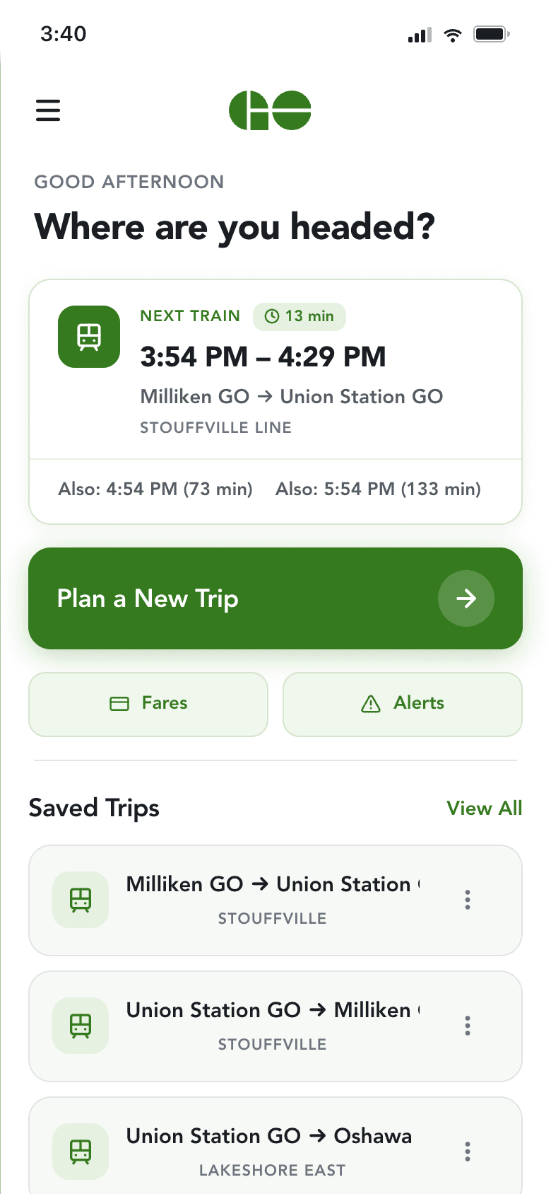
0 taps — next train visible on load
Live countdown, a time-of-day greeting, and one-tap trip planning. The next departure is the first thing you see.
On load, the homepage now shows the next departure — down from three taps in the original.
Design Decisions
Three changes that mattered
Decision 3 · in context
Alerts that reach you before you've left the platform.
Saved-trip alerts surface on the lock screen, grouped, and colour-coded by severity. Red for cancellations, orange for delays, green for general info. A rider checks the phone once and knows whether the morning routine still works.
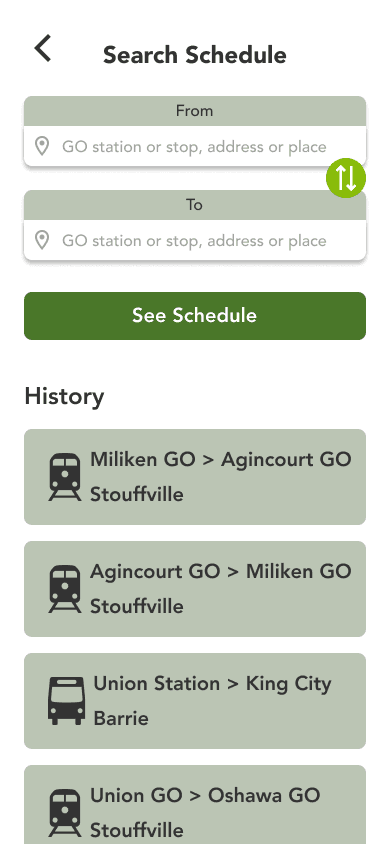
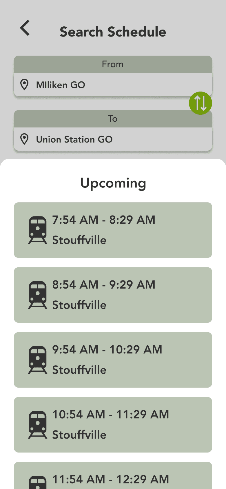
Purchase Flow
Home → Search → Details → Pay → Ticket
Every step from opening the app to holding the boarding pass is interactive and live. Hover each screen to see it in motion.
Home
Next train visible instantly

Search
Results with live times

Details
Custom map, stops, platform

Pay
PRESTO, Visa, or new card

Ticket
QR code + Apple Wallet


Dark Mode & Accessibility
Designed for the 6 AM commute — and for every rider
GO's peak hours are 6–9 AM and 4–7 PM, and through an Ontario winter both are dark. For most commuters that's simply how they'd see the app, so dark mode wasn't an afterthought. And because transit has to work for everyone, accessibility shaped the system from the start.
Recollect
What the build taught me
3 → 0
Taps to Next Departure
Was 3 in the original. Now visible on load.
3 → 1
Apps to plan a trip
Was juggling GO Transit site, Google Maps, and PRESTO. Now one app handles plan, pay, and ride.
7 → 16
Screens
Static concept to interactive product.
What I learned
Building it surfaced what Figma hid
The Figma prototype tested well in walkthroughs — but building it for real exposed deeper, more insightful gaps. Code lets me see what the end result actually looks and feels like, and learn the real constraints of what's technically feasible — so my future designs are more grounded. I'd build earlier and iterate in both code and Figma from mid-fidelity onward.
Accessibility worked better as I designed, not after
Reviewing the app against WCAG 2.1 AA guidance surfaced assumptions I didn't know I had — and usability gaps I didn't know I needed to design for. Contrast that looked fine wasn't. Touch targets that seemed big enough weren't. I now check accessibility as I design, not as a final pass.
The details users never notice
A rider never notices that tapping a recent trip fills both stations and opens the schedule sheet in one motion — they just feel the app is fast. They don't see the empty-state CTA when no trips match. They don't clock the live countdown ticking. Those small moments are what make the app feel solid instead of fragile.
Fast iteration exposed weak decisions
Using AI tooling meant my design decisions could be implemented in minutes, not days. When something looked wrong, I couldn't blame slow build time — I had to ask whether the design itself was right. That tight feedback loop was the most valuable part of the process.
Where AI helped — and where I didn't lean on it
AI can speed up the workflow when you treat it as a tool, not the steering wheel. I still hand-craft the design language in Figma and prototype it quickly with Claude Code — and when something feels off, I pull it back into Figma to refine by hand. A natural fit for double-diamond work: expand quickly, refine carefully, expand again.
Where we landed
From three apps to one.
Plan, pay, and stay informed — without leaving the app, juggling a kiosk, or refreshing a website.
A 2026 note
Since this project began, PRESTO has rolled out tap-on / tap-off, distance-based fares — you tap entering and leaving, and your fare adjusts to the distance automatically. That removes much of the payment friction this concept set out to solve. It doesn't touch trip planning, real-time alerts, or a single unified rider experience — so if I picked this up today, that's where I'd point it. Worth being honest that the ground shifted while I was building.